Customer Churn Analysis

Photo by bruce mars on Unsplash
Background
For a business, acquiring a new customer is far more
expensive then retaining an existing one, making customer churn one of the critical
metrics to track and focus on. By
definition, customer churn is the percentage of customers that stopped using a
company’s product(s) or service(s) during a specific time period. In this post, we will discuss manipulating a
dataset to create relevant features for predicting customer churn and build and
evaluate machine learning models using Apache Spark.
The dataset was provided by Udacity towards their Data Science Nanodegree program. It was in a JSON file format and contained 286,500 records of event log data for October-December 2018 for a fictional music streaming platform called Sparkify, similar to companies like Spotify and Pandora.
Churn Definition
For the dataset, variable called ‘page’, showing which
platform page the event is linked to, was used.
The option ‘Cancellation Confirmation’, which refers to the company’s
confirmation of a customer’s inquiry to cancel their account became the
flag. Using this page event as the churn
definition means that a customer has churned only when they have completely
stopped using the service and cancelled their account.
This page event applies the same way to customers on both
free and paid subscription plans, which makes this information easy to recode
into our model target variable.
Data Exploration
The 278,154 rows of event logs (excluding 8346 records with
no user data) in the dataset belonged to a total of 225 unique users, with 52
of them churned users and 173 active users.
As expected, active and churned users show differing
behaviours, some of which are highlighted below:

Above graph shows that more than 80% of all events for both
active (in blue) and churned (orange) was related to playing songs.
- Average number of songs played per active user is 1108 and per churned user is 700
- Average number of thumbs up per active user is 62 and per churned user is 36
- Average number of friends added per active user is 21 and per churned user is 12

Average session length for active users (5.0 hours) is
slightly more than churned users (4.7 hours).
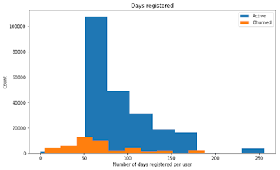
Active users are registered for more days than churned users (93 vs. 68).
Proportion of users on paid plan and free plan is similar
across active and churned groups.

If we look at the statewise distribution of users, the Churn customers over-index in KY, MI, CO, MS, AL, OH, IN, WA, and AR significantly.
Feature engineering and selection
To run the models, columns of interest
– the ones that differentiate between active and churned users were selected.
And, before selecting which features to use in modeling, we
need to create some new ones to understand our data better. Based on our analysis and finding columns
with differences across the user groups, we have recoded the frequency per user
of number of events, number of sessions, average session length, number of days
registered on the platform, number of songs, unique artists and unique songs
played, number of thumbs up, friends added and home page visits, number of ads
received, into new variables. We have
done this to be able to use this information as input features when modeling,
but restructuring the data so that there is one row per user instead of per
event, since we are interested in user-specific behaviors.
Some columns were recoded as well i.e. Unix timestamps to a
readable format to calculate the average session length, and the original
location variable which had both the metropolitan area and the state in the
same column was split into two separate columns.

Above is the correlation matrix of all numerical columns,
including the new recoded columns. We have also included ‘gender’, which we
have recoded from a categorical to a binary numerical column, to be able to
calculate its correlation to other columns. The correlation matrix shows that
the total number of songs played (‘total_nextsong’) has a perfectly positive
correlation with the total number of events per user (‘total_events’) and the
total number of unique songs played (‘unique_songs’). No columns appear to have
a high correlation with our target variable ‘churn’.
Feature selection is the process of selecting a subset of relevant features to use in building our model. We do this, among others, to enhance the model’s ability to generalize by reducing the risk of overfitting, shorten the training times and to simplify the model and make it easier to interpret. Based on our analysis, interesting columns that show differences between churned and active users, and that are good input feature candidates, are:
- number of days registered on the platform (‘days_registered’)
- number of events (‘total_events’)
- number of unique artists played (‘unique_artists’)
- number of unique songs played (‘unique_songs’)
- number of thumbs ups given (‘total_thumbsup’)
- number of home page visits (‘total_home’)
- number of friends added (‘total_addfriend’)
- number of ads received (‘total_rolladvert’)
- the location of users (‘state’)
There were also differences between the user groups in the number of songs played (‘total_songs’), but as seen in the correlation matrix, this column was perfectly correlated to other ones. Good input features should not be highly correlated to each other, and to avoid that situation we removed this feature with the highest correlations to minimize this problem a bit, even though many of the other features still are highly correlated to each other.
To be able to use our columns of interest in modeling, we
need to transform them into a format that works in a machine learning
model. Our state column consists of
nominal categorical values with no notion or sense of order amongst them. In
general, machine learning models cannot handle this kind of data and we need to
recode each state option to its own binary column, indicating if that state is
selected for the row (code 1), which is called one hot encoding.
We should also apply some form of feature scaling to our
numerical columns. The range of values across our columns varies widely, and in
many machine learning models, objective functions will not work properly
without normalizing these. Normalizing these means that each feature
contributes proportionately to the model and not based on the different ranges
of values in each column, which would mean that a column with higher values
would be more important to the model than a column with low values. The
MinMaxScaler is a good feature scaling method for our data, it gives each input
feature a value range of 0–1, but still preserves the shape of the original
distribution.
We set up a data pipeline to transform the columns into
useful input features. All columns of
interest were recoded into numerical features, scaled uniformly, converted into
one vector. This new vector is the input data we will use to train our models.
Modeling and hyperparameter tuning
We are dealing with a binary classification problem (if a
user belongs to the class ‘churn’ or not) and to start exploring which models
are suitable, we will instantiate and train multiple models from the Spark ML
Package that work on classification problems. This is a good way to understand
what kind of model works best with our data and to get baseline performance
results as well, how each model performs on the data without any hyperparameter
tuning.
Before training our model, we need to split our dataset into
separate training, validation and test datasets. This is so that we have some
data to train on and some unseen data left to test the model with.
The selected models to test come from Spark ML’s classification
module and are suitable for binary classification:
- Naive Bayes Classifier
- Logistic Regression
- Linear Support Vector Classifier
- Random Forest Classifier
- Decision Tree Classifier
Naive Bayes is a simple and straightforward model that could
be a good baseline model to compare more complex models to. Logistic Regression
and Linear Support Vector Classifier assume a linear relationship between the
data, meanwhile the Random Forest and Decision Tree models can be applied to
non-linear relationships as well. These models could be good to compare to each
other to see how well they fit our data and whether it appears to have a linear
or non-linear relationship.
Instantiating and training a model without any
hyperparameter specifications (and timing how long this takes) is simple:

After instantiating and training all our models, we will
test them on the validation set (the test set is reserved for the final model
evaluation, after any hyperparameter tuning). Our dataset has imbalanced
classes, there are only 23% churned users, which means that evaluating our
model performance with a metric such as accuracy is not a good idea. The
accuracy could be high because the model predicts well on the majority class
(active users), but that would not be a good model for us since our goal is to
predict on the minority class (churned users). Using the F1 score as our
performance metric is a better option, it is the harmonic mean of precision and
recall. Precision and recall calculations do not make use of the true
negatives, they are only concerned with the correct prediction of the minority
class.
Another performance evaluation metric that is suitable is
the area under the precision-recall curve. Precision-recall curves are more
informative than the receiver operating characteristic curve (ROC) when
evaluating binary classifiers on an imbalanced dataset, and a precision-recall
curve is a plot of the precision and the recall for different thresholds. The
area under the curve (AUC) can be used as a summary of the model skill. Area under
the PR curve will typically show larger differences than area under the ROC
curve when comparing classifiers trained on imbalanced data.
Baseline results are as follows:

The Decision Tree model has the best baseline results on the
validation set in terms of both the F1 score of 78% and the area under PR score
of 75%. Let us continue with the best performing baseline model and try tuning
some of its hyperparameters to see if we can improve it further.
To test different variations of a hyperparameter, we can set
up a parameter grid with all hyperparameters and options to test, and use this
to cross-validate (CrossValidator in Spark ML) over a specific number of folds.
Cross-validation is a technique where you partition the data and test the model
multiple times (over k folds) and average the results of each test to get a
more accurate estimate of model prediction performance. The CrossValidator
returns the model with the best results.
You can find a description of which hyperparameters that
exist for you model by running your_model.explainParams(). The hyperparameters
we have chosen here to test in tuning the Decision Tree model are ‘impurity’
and ‘maxDepth’. The ‘impurity’ parameter with ‘entropy’ and ‘gini’ refers to
which criterion to be used for information gain calculation, and ‘maxDepth’
refers to the maximum depth of the tree.
Let us test the tuned model on the validation set (only for comparing with the baseline results) and on the test set (the actual performance evaluation). We can also test the baseline Decision Tree model on the test set to be able to compare the final performance of both models. The results for the tuned Decision Tree model and the baseline Decision Tree model are:
- F1 score for tuned decision tree model on validation set: 0.78
- F1 score for tuned decision tree model on test set: 0.64
- F1 score for baseline decision tree model on test set: 0.63
The tuned Decision Tree model performs the best with an F1
score of 78% on the validation set and an F1 score of 64% on the test set.
Model Feature Importance
To understand our tuned model better, we can look at how
important each feature is to the model in predicting customer churn. We can
extract the input vectors and their feature importance score from the model’s
metadata, and map this to the actual feature name. We can also calculate the
cumulative feature importance score of a feature and the features before, to
get a sense of their combined importance. Running the function above on our
best tuned Decision Tree model, we get these feature importance results, shown
in descending order:

We then get this plot with the feature importance results
for our tuned Decision Tree model:

Above we can see the top 15 most important features for the
tuned Decision Tree model in predicting churn. The score is the weight of the
feature, and the higher the weight the more important the feature is to the
model. The weight of a feature indicates its predictive power. The cumulative
score shows the total predictive power of a feature and its previous features.
The most important features are ‘days_registered’, ‘total_rolladvert’ and
‘total_home’, which have a weight of 42%, 19%, and 12% respectively. This means
that the most important user behaviours to this model in predicting customer
churn are the number of days a user has been registered on the platform, the
number of ads they have received and the number of home page visits.
The first 7 most important features have a cumulative weight
of 1, which means they add up to a predictive power of 100%. All features
displayed after this do not add any useful information to the model, and we
could simplify the model by removing these and still get the same model
performance. However, this would not make sense in our case, since almost all of these
features belong to the same variable, ‘state’, and it would not make sense to
remove only some state options from that variable.
Results
Based on this tuned Decision Tree model, it could be wise
for the company to set up an alert system to communicate with a user after a
certain number of days to minimize the risk of them cancelling their account,
look more into finding an optimum number of ads a user can tolerate and build
the platform to increase a user’s experience with the home page better.
Further model improvements
There are many ways to further improve this churn prediction
model.
- Included more variables like ‘Add to Playlist’ and ‘Thumbs Down’
- Tested statistically sound dimensionality reduction or feature selection in the pre-processing, such as conducting a Principal component analysis (PCA) or applied a Low variance or High correlation filter on the input features, to remove unnecessary features or reduce them but still allowing them to convey enough information about the data.
Due to our dataset being imbalanced between the classes, we
could have benefited from using a bigger dataset or maybe over- and
undersampling of churned and active user groups to get a more even distribution
of examples to train on. We could also have used more model performance tools,
such as bias-variance plots that visualize how the model’s train performance
compares to its test performance, to simultaneously minimize the bias and
variance, two sources of error that prevent models from generalizing beyond the
training set.
We could also have removed outliers from the dataset to see
if this would improve model performance. Though, in our case, that would have
left us with even fewer examples to train on and would probably only be
suitable if we had access to more data.


